What: iOS application prototype
What: Part of a 10-week User Experience Design course, through General Assembly.
Why: It was great to be able to do a project that was purely UX-driven and didn’t need a finished product at the end. Time was spent exploring as many research methods as possible within the time frame.
Scope of work:
- Interviews
- Competitive Analysis
- Affinity Mapping
- Contextual Analysis
- User Interface Design
- Usability Testing
Tools:
- Figma
- FigJam
- Otter.ai
- Maze
The challenge
How might we help readers navigate their own e-book collections so that they can easily decide what to spend their precious time reading when choosing their next book?
The process
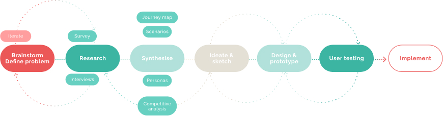
User insights
I interviewed 8 participants, the majority were 18-35, young adults. 75% were Amazon Kindle users, and all had 10+ books in their Kindle library that they had not read.
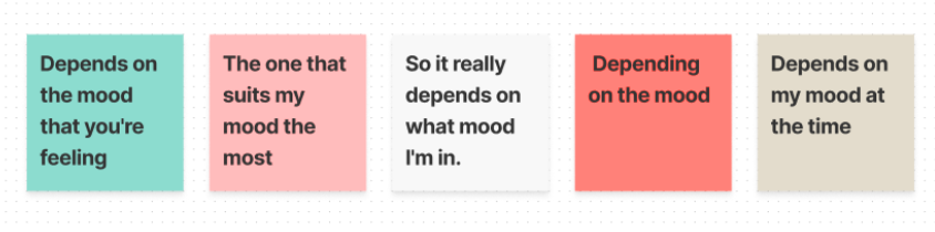
Affinity map section on “Mood”
Mood:
Participants noted mood as an important factor in deciding which book to read.
Recommendations:
All users had at some point relied on recommendations to make their choices. Majority valued recommendations from family and friends over online reviews.
Commitment & forgot:
Time lost reading something of little interest, forgetting what one had already purchased were problems the users faced.
Search:
Users found the Kindle library search limited, functionality was only available in the store-front. They spent lengthy amount of time looking for something to read.
Personas and user flows
Pinpointing pain points was made easier through user flows and personas. Combining this with feature prioritization diagrams let me to focus on three key insights:
-
Sort
-
Recommend
-
Remind

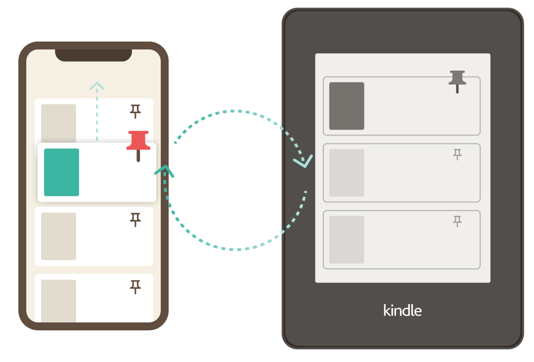
Minimum viable product
Defined as a MVP it would be: Somewhere the user can sync their Kindle list so that they may: sort it, recommend/share it, and be reminded of it’s content.
This meant that changes would also need to be done to the Amazon Kindle platform to better sync it and the Library list showing on the mobile application.

Testing
Two rounds of testing was done: first was a series of moderated tests of a wireframe level fidelity prototype. After changes were synthesized and implemented a second round of testing was done using Maze on a high fidelity, mock-up, level prototype.
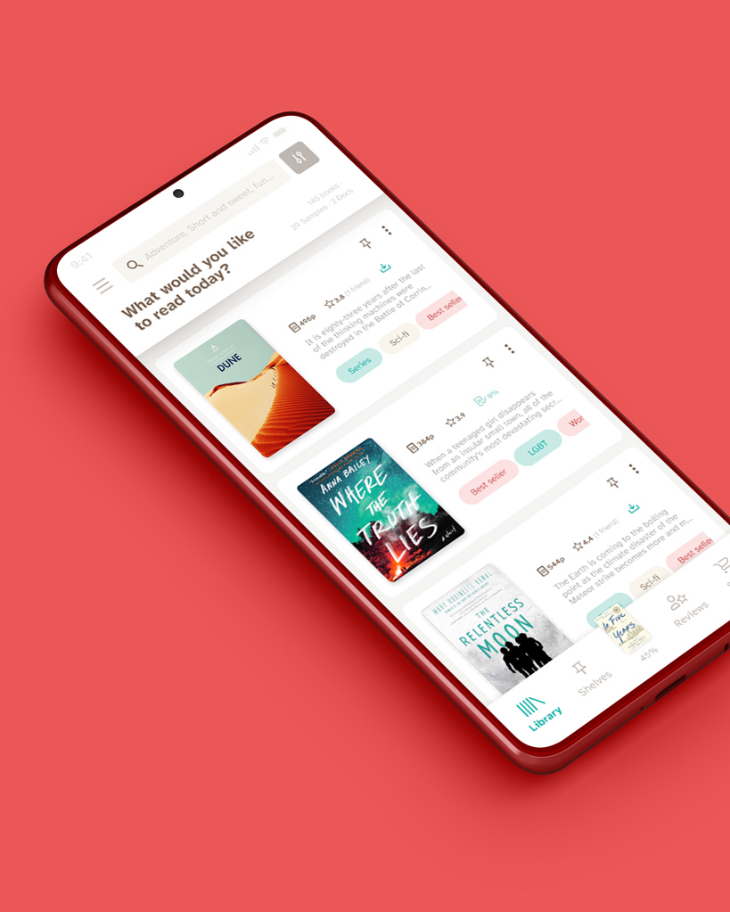
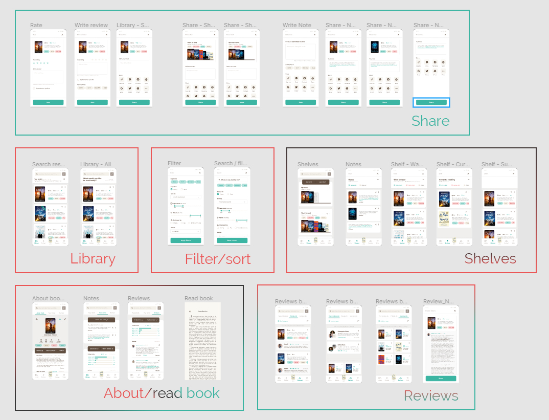
Prototype
Each screen in the second prototype tries to address the different user pain points, sort, recommend, remind. Testing showed that this prototype could also do with another round of changes to create more happy paths.
Deliverables
The final deliverables for this project was a research report detailing the process and findings that concluded in a set of recommendations for future implementations, such as:
- Further testing
- Reminder features
- A discover function
- Onboarding screens