What: Brand audit of the Ektor brand, and continual art direction of Evolts design team.
Clients: Evolt Pty Ltd and zencontrol Pty Ltd. Ektor is an emergency lighting product range, manufactured by zencontrol and sold by independent distributors worldwide, with its largest share being sold in Australia through Evolt.
The Audit Team:
- 1x Designer (my role)
- 1x Web developer
- 1x Electrical engineer
Evolt’s design Team:
- 1x Lead Designer (my role)
- 1x Senior Graphic and Web designer
- 3x Junior Graphic designers
Scope of work:
- Research
- Strategy
- Branding
- Web design
- Illustrations
- Icon library
- 3D rendering
- Packaging
Tools:
- WordPress
- SAP (Back-end)
- Adobe XD
- Illustrator
- Photoshop
- Indesign
- Keyshot (3D)
- Creo CAD (3D)
- BarTender (print)
- Google Analytics
The challenge
The Ektor brand had 10+ years of design; packaging, collateral, web, and more, strongly influenced by its first distributor, Evolt in Australia. Whilst zencontrol as a company and Ektor as a brand were growing, internationally and domestically, Evolt wasn’t.
zencontrol’s goals
The brand image needed to build on the recognition of the original brand, distance itself from Evolt whilst establishing stronger ties to zencontrol and the ideals it stood for such as innovative technology.
Evolt’s goals
Ektor needed to modernise to keep its image as an innovator on the market, whilst also giving it its own reason for being so that a larger design team could continue to create a consistent image.
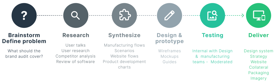
Research & strategy
Through talking to stakeholders, designers, manufacturing and customers we defined that while a simple refresh of colours, fonts and logo was essential it would not be enough to achieve the goals. The brand had no reason for being, no core message, no concept to build on. Developing a brand management strategy, and a design system for everyone involved was crucial to long-term success.
What separates Ektor from its competitors needed to be reflected in its branding.
A toolbox
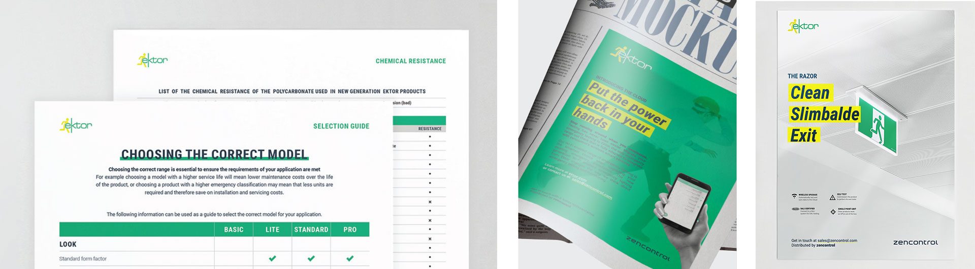
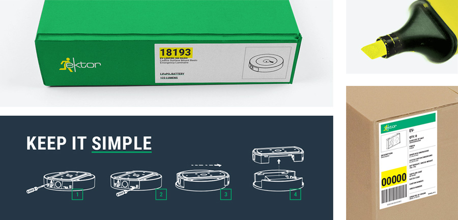
It was necessary to create a detailed design system that can be used by both the graphic design team, marketing and understood by the manufacturing team. The new concept allowed for highlighted sections on packaging and labels making manufacturing, shipping, and warehousing more efficient.
“Highlighting the difference” can be used in a multitude of ways. Detailed brand guidelines were made to show a series of examples, as a toolbox for everyone to use.
Efficiency
This was also the time to resolve issues raised by manufacturing, designers, and distributors:
- Poor legibility of fonts
- An overall design that was not suitable for web
- Use the design to increase the efficiency of manufacturing, shipping and warehousing.
The new labels, instructions, and packaging were made to be templates for easy cut & paste by factory workers. The design also highlighted important areas for warehousing to more easily identify the codes they needed to register.
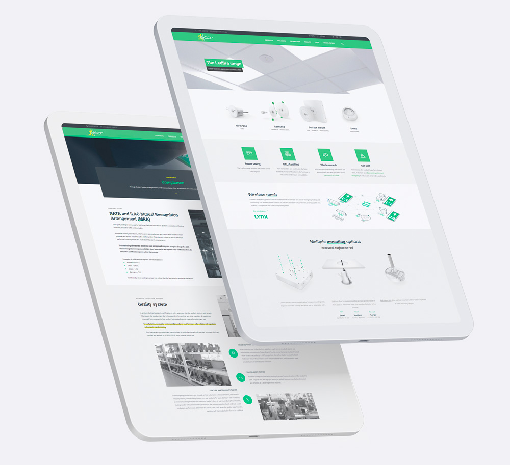
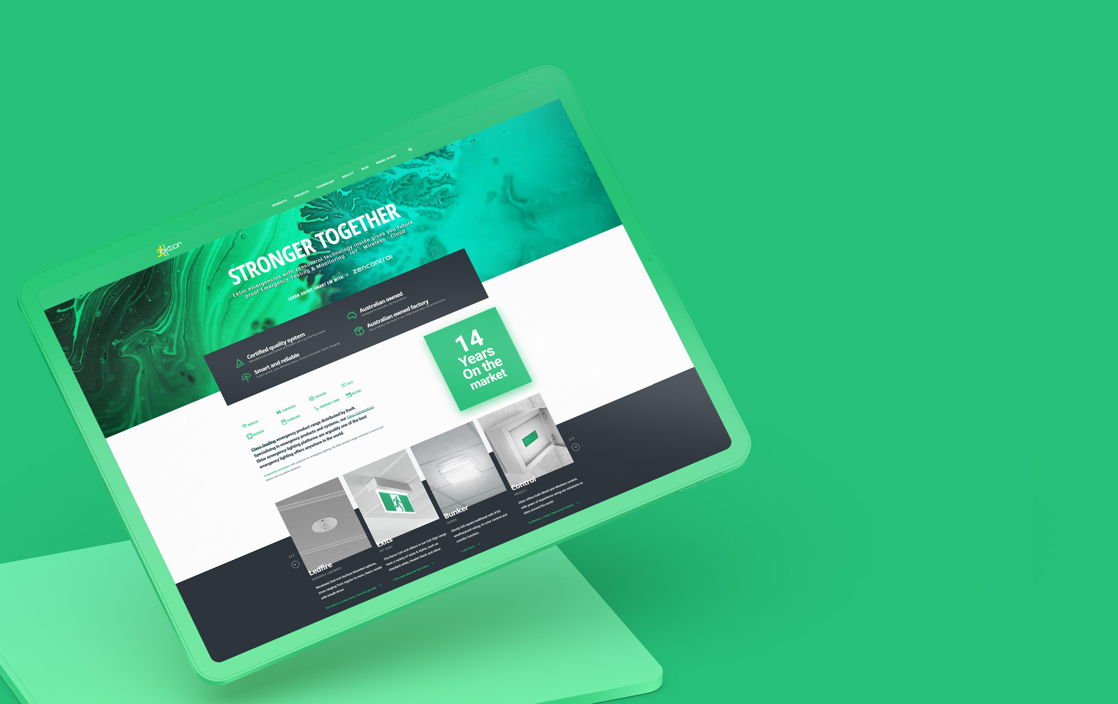
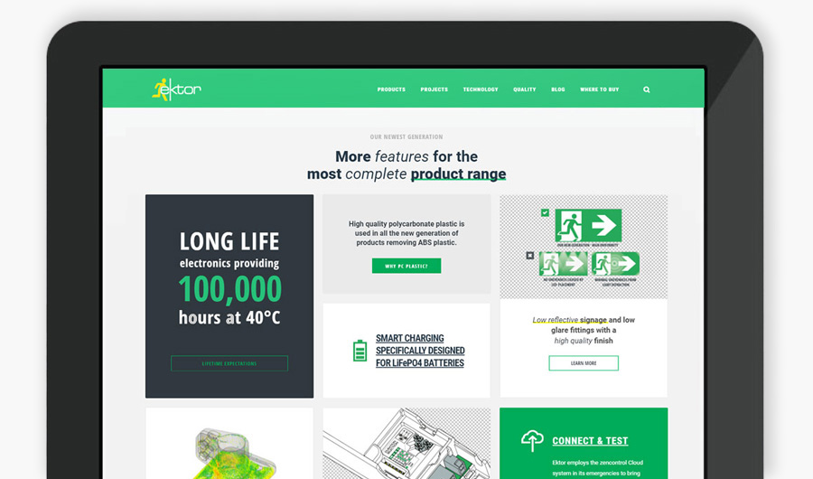
Website
The website got a major overhaul to convert it to a knowledge base for the domestic and international community of distributors. A large focus was put on content, bringing more product imagery and downloadable resource files onto the website.
All product-relevant specifications were now integrated with and drawn from SAP, and datasheets were now generated automatically, freeing designers from having to make and manage product information.
The idea of blog content was also introduced. This would keep distributors up to date with the latest product releases and further show Ektor as an innovator in the busines, publishing technology posts.
Visit ektor.com.au
Evolt was also given an update with a simple wordpress site to guide customers to its brands, Ektor and Atom.